What's new in Designer
Version 5.0
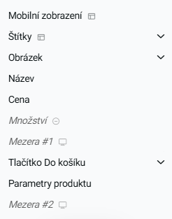
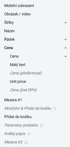
More editable elements in the template
We're expanding the possibilities of the Designer!
You can now edit even more elements directly in the template, giving you greater freedom and control over the look of your e-shop—without needing to touch any code.
Thanks to this update:
- You can modify more parts of the page directly in the Designer environment
- You can tailor the template even more closely to your specific needs
The Designer becomes an even more powerful tool for anyone who wants their e-shop to look perfect down to the last detail.
- Version 4.2
- New options in 5.0
Edit the Cookie Bar
Want full control over your cookie bar and want it to match the rest of your e-shop? Now you can! You can now customize the appearance and content of the cookie bar directly in the Designer.
🎯 What can you edit?
✔ Colors, texts, and button styles
✔ Position and overall appearance to match your design
✔ All without touching the code
With this update, you can have a visually consistent and functional cookie bar that fits your shop’s style – quickly, easily, and right in the Designer. 🚀✨
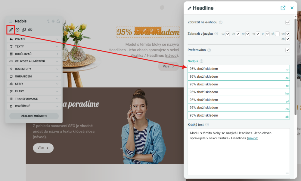
Edit content directly in the Designer
We've improved content editing of individual elements. You can now edit the content of each component directly in the Designer—no more switching between pages in the admin.
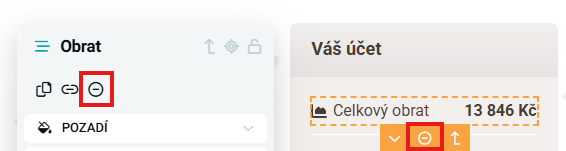
Customer account – Option to hide total customer turnover
Based on your feedback, we've added a new feature to customer account settings – now you can choose whether or not to show customers their total spending.
🎯 When is this useful?
- If you don't want customers to see their total spend
- If turnover isn’t relevant to your loyalty or discount programs
- For a cleaner and more streamlined customer interface
You can easily activate or deactivate this feature in the Designer.
Social media widget now available outside the homepage
Our popular social media widget (page-text-widget) is now also available beyond the homepage—by popular demand!
Product item – Labels
Layout no. 3 has been removed due to the new option of block sorting within the template.
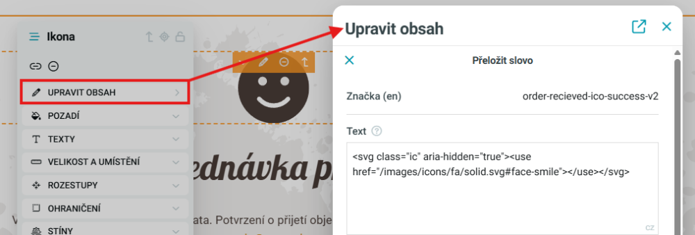
Custom icon on the Thank You page
You can now customize the icon (emoji) shown to customers on the order confirmation (Thank You) page. Whether you want to add your own icon or change the expression, now you can!
🎯 How to do it?
Use the following translation keys:
order-recieved-ico-success– for successful ordersorder-recieved-ico-warning– for warnings or info
You can replace this icon with your own image or symbol—easily via translation management.
🎨 Enhance the customer experience right to the final step!
Information bar in the e-shop header
You can now edit the information bar in your e-shop's header directly from the Designer.
🎯 What does it bring?
- Quick and convenient text, link, or call-to-action edits
- Instant preview of changes in the template
- Ability to modify messages during promotions, holidays, or sales

“Bestsellers” section with new layout options!
Your customers deserve a clear and appealing view of your best-selling products—and now you have more options for how to present them!
The “Bestsellers” section now offers multiple layout types so you can choose the one that best fits your shop’s style.


Version 4.1
Version 4.1 brings several new options and extensions for configurations of individual elements. When switching from older templates, it is necessary to take into account the necessity of minor adjustments within the existing settings.
New layouts for the e-shop logo
The logo displayed on the e-shop now offers 3 layouts with different sizes. You can thus better adapt the size of the logo to your requirements.
Main banner in mobile view
For mobile display (XS size in the Designer module) you can create a special banner that replaces the regular main banner used on larger displays. With this step, you can easily prepare different banner content for mobile phones than what will be displayed on larger displays. More here.
EAN display in product detail
The main description in the product details offers the possibility to display the EAN code. Its location depends on the selected layout. By default, the display of the EAN code is disabled, it is necessary to turn it on manually in the Designer.
Hiding individual filter types and sorting in the product list
The Designer module now allows you to hide the individual types of filters and sorting offered in the product list.
Main photo in product detail
The main image in the product detail now offers the option of arrows for easy scrolling between individual product images. It is also possible to set its maximum height. The main image now uses a layout across the entire width of the container.
Slider / classic list view
For selected elements on the page, you can set their display type (slider or classic list of items). You can also choose whether the content of the given slider / list will be directly visible or if it will be hidden under the Next button. This is, for example, a list of images in the product detail.
Notice for reviews in the product detail
In the product details, you can add a notification that will be displayed above the form for filling out stars and reviews. You create the alert content using a translation with the alert-reviews key.
Text for the search field
For the search field, you can create a translation with the search-input-text key, which will be displayed on its background until the first search character is entered. If this translation does not exist, a translation with the Search key is written on the background of the search field.
Shop Benefits - appearance without the use of an image
If no image is used for the Shop Benefits section, the description and the benefits themselves will each take up half the width of the page. Until now, the split was 1/3 and 2/3 of the page width.
Version 4.0
Version 4.0 brings a major overhaul of the Designer module, which responds to modern trends in the field of graphical configurators. Designer 4.0 brings fundamentally expanded options for configuring individual elements. When migrating from older templates, it is necessary to take into account the need for minor adjustments within existing You can read more in a separate article and help.
New interface
The top bar allows you to quickly navigate to the section you want to edit. Of course, there is also a preview for different display types. You can also easily publish changes directly to the sharp domain. Backups are moved to the "more" section.
Movable left menu
The left menu can now be anchored or free and moved freely around the page, so that it doesn't get in the way of the edits you are currently making.
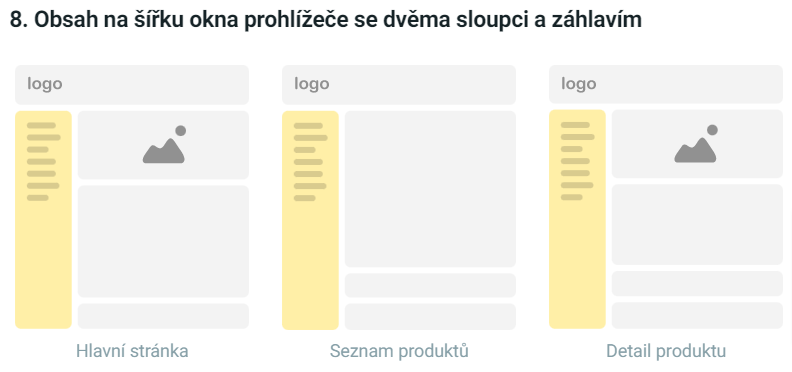
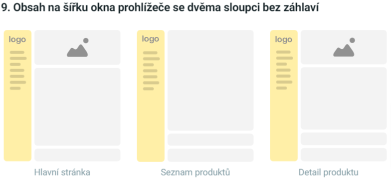
New page layout
We have added a new column layout:
New colour - secondary (light)
There is now a secondary (light) color in the color menu, which is created based on the secondary color.
Additional adjustment of the light shades of the primary and secondary colour
You can edit the lighter shades of colors using the saturation and lightness sliders.
Gray mode cancelled
The gray mode, which converted very pale shades to grayscale, is completely removed.
Hiding elements
Elements or entire sections can be easily hidden at the click of a button and then re-displayed if needed.
Different settings for desktop, mobile, tablet
With approximately 50% of customers shopping online via their phone, we place great emphasis on responsiveness. Individual elements can now be set to display differently on different display sizes.
Image section dividers
We have removed the fixed separators from the theme settings. You now set the separators separately from a variety of shapes to suit your needs. You can put them at the top of the section or at the bottom as you are used to.
Background graphics
You can now overlay the background of sections with different textures, images, patterns or masks. You can combine all the options and determine their order. This gives you virtually unlimited possibilities to combine settings, where you can create a professional-looking look from these simple graphic elements.
Transformation
Allows horizontal, vertical or spatial rotation of elements. You can also adjust their vertical and horizontal size, offset, skew, alignment.
Object transparency
Within the filters section, you can make elements and sections slightly or more transparent.
Color gradients
You can create color gradients when overlaying the base colors with any of the preset dark colors. For these, you set the direction of their gradient, or one of two circular transitions.
Blend mode
As in other professional graphics editors, you can combine layers using different blend modes. These allow you to make unique graphic elements and photo adjustments right in Designer.
Min. and max. heights and widths of elements, sections
You can adjust the preset layout of sections and elements by specifying minimum and maximum widths. The latter can of course be set differently for each display size.
Font
With regard to the font, you have the possibility to edit it from the view:
- Size,
- line height,
- font style,
- displaying only upper/lower case characters,
- italics,
- bold,
- colours.
Disable internal lines
Some item lists contain lines that serve as internal line separators. These can now be easily hidden with one click.
Align text, content
There is no longer a need to have the entire e-store left or center aligned. You can now align individual elements as needed.
Graphic elements page
We have added a new page with basic elements. On it, you can find all the elements that appear on the e-shop and you can check that you are following the rules for your design for all the elements on one page.
Inner and outer spaces
For elements, you can set padding and margin values that create inner and outer spaces between the element and its surroundings.
Variants - display of variant code
When displaying a tabular view of product variants, a new column with the code of each variant has been added.
Notified in the cart when you complete your purchase
A new hidden "alert-cart" translation is created in the cart detail. If you fill it in and there is a product in the cart, an alert will appear. In the translation you can fill e.g. Don't wait long! The product in the cart is not reserved.
Text fields in graphics
Used to put different text fields in graphics without having to turn off Designer. You can find a list of them here.
Search - cross to turn off
When a search is opened, the magnifying glass changes to a cross to close it again.
Lightbox - switching off
Option to turn off the lightbox on the entire desktop. If there are arrows, switching off is not possible.
We record all subsequent changes made in the Designer for you in detail since the new version 4.0. You can find the current list of changes on the Changelog page.
Version 3.9
Older versions of Designer can no longer be edited
It is no longer possible to edit versions of Designer lower than 3.0. In this case, the module offers the option to update Designer to the latest templates or switch them to the Code Editor.
Hiding the customer's price list on the e-shop
In the Designer it is possible to hide the price list of the registered customer, which is displayed in the header on the e-shop website. This option is available from Designer version 3.9.
Note on shipping and mobile payments
The note for transport and payment is now immediately visible in the mobile view (previously displayed after clicking on the icon).
Version 3.8
Extending the capabilities of the Designer
Additional options for title font size, title font compression, border contrast, and section spacing.
New preset template - Boost design
We have added a new option in the menu of preset templates - Boost design. More info.
Option to hide the Add to Cart button in the product list
In the Designer graphics module, you can hide the Add to Cart button for all items in the product list.
Hide the article creation date
In the Designer module it is possible to hide the date of creation (creation) of articles.